Our logo and website have a new look

We’re making our visual communications more accessible and inclusive
Published on 03 March 2022

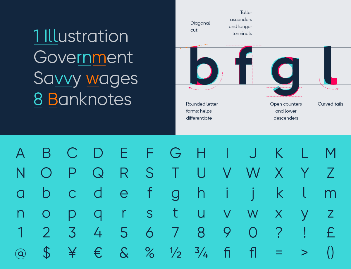
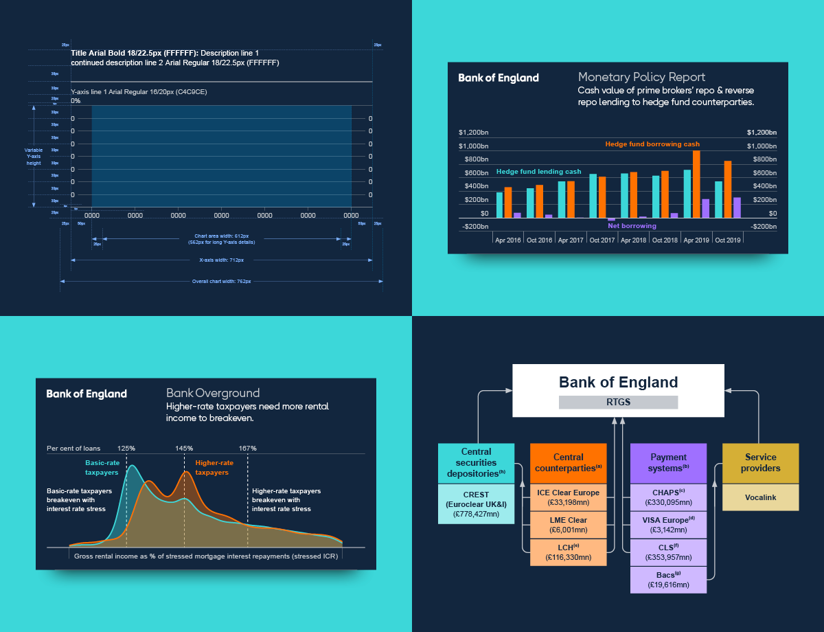
One part of how we communicate is the ‘look and feel’ of our content. That includes things like our logo, and the colours and typography we use. 

We want to make these things more accessible and inclusive. So our in-house designers have worked in the past years to create a new, digital-first ‘visual identity system’ for our website and publications. 

We will keep on working to improve the way we communicate because this will help us to carry out our mission.

This video requires third-party analytical cookies to play. Read our cookie policy for more information.

"How we communicate is part of how we carry out our mission. We intend to keep trying to make our communications more inclusive and accessible for everyone.” 

Andrew Bailey

We’ve made our logo simpler and Britannia more in line with our values

Our new logo reflects our commitment to be plainer and simpler, and it retains legibility on all digital devices and small formats. It has been designed with our dyslexia-friendly typeface. 

Britannia is the female personification of the British Isles. She has represented us since we were founded in 1694, and we’ve updated its design a number of times since then. We wanted a new Britannia that reflects our current mission and values. She’s more welcoming and less statuary. The ostentatious pile of coins has been removed, as we don’t issue coins. We’ve reintroduced the Union Jack because, despite our centuries-old name, we are the central bank of the United Kingdom.

Our new typeface is easier to read

It's estimated up to 1 in every 10 people in the UK has some degree of dyslexia.

So we have designed a new typeface that helps people read our content more easily.

The design was created by industry-leaders in type design. It’s based on guidance by the British Dyslexia Association.

BOE-VIS-2

We use colour to help make our content accessible

Colours are an important part of our content design. The colours we use are inspired by our banknotes. But, more importantly, we use colour to make our content more accessible. 

For example, we make sure there is enough contrast between the colour of our text and the colour of our backgrounds. This means we can comply with Web Content Accessibility Guidelines.  

We’ve redesigned our charts to make them more readable

We design thousands of charts every year. It’s important that our messages are laid out in the most readable and accessible way. We have designed a template that simplifies the way we produce charts, so they are optimised for all uses.

BOE-VIS-4

Our new photography lets us focus on what matters

We have simplified the way we use images. We created a library of photos of our banknotes, our building and our people. So, we can focus more on the messages.

BOE-VIS-5

What our Governor says 

“The Bank of England has been around for hundreds of years, but it embraces advances in digital technology.

These advances have brought many benefits. One is that it brings us closer to the public we serve. We know this means we have to explain what we do and why. 

How we communicate is part of how we carry out our mission. We intend to keep trying to make our communications more inclusive and accessible for everyone.” 

Andrew Bailey